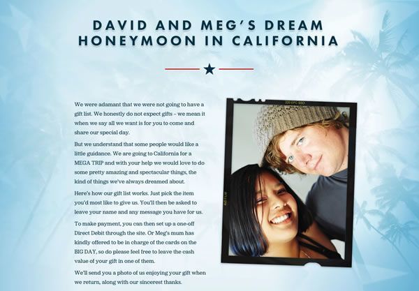
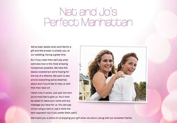
The wedding gift list to fund your dream honeymoon


You get funds to help pay for your honeymoon, your guests get to choose a wedding gift that’s meaningful

Why a honeymoon gift list is better than cash
Our service allows your guests to express their love for you in style.

Seventeen years
Since 2007, we’ve served thousands of couples from more than fifty countries, with hundreds of thousands of gifts totalling more than 10 million pounds.


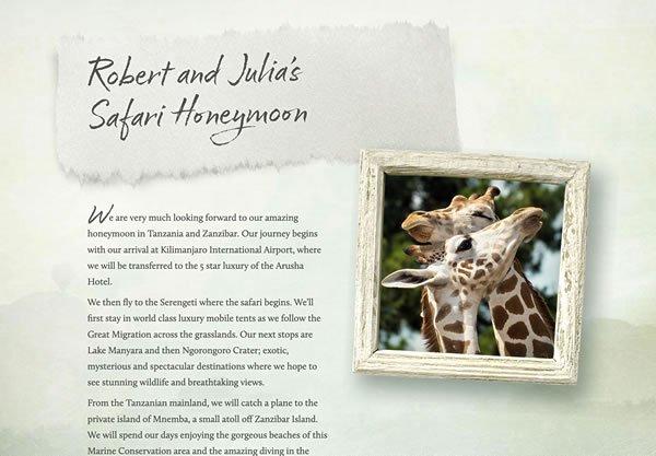


Real Life Honeymoons:
Sri Lanka and the Maldives
Khadeesha and Dominic used our service to fund their honeymoon with the help of their guests.

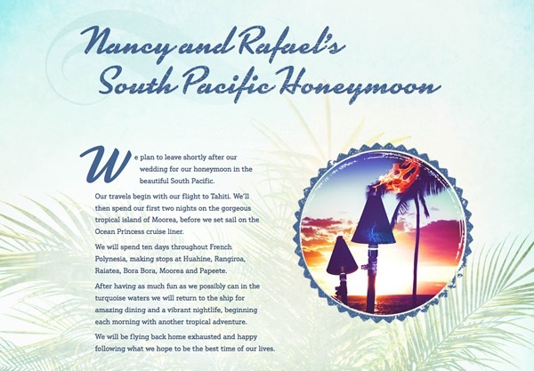
Real Life Honeymoons:
USA Road Trip
Emma and David’s epic 5-week road trip across Nevada, Utah, Arizona, California and Hawaii.

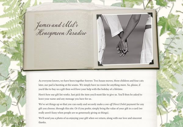
Real Life Honeymoons:
Nepal and India
Tasha and Peter used our honeymoon fund for their journey from Kathmandu to Kumakaron.